Tuesday, July 12, 2011

One Night, One Craft at the Cincinnati Contemporary Art Center

One Night, One Craft at the Cincinnati Contemporary Art Center


Tonight was yet another fantastic evening at the Contemporary Art Center!  If you have not had an opportunity to check it out, let me introduce you to “One night, one craft!”  This genius summer series each Monday night at the Contemporary Art Center provides a two hour opportunity to learn a new craft from a skilled artist with an adult beverage in hand surrounded by other creative artists in training, and no judgement.  Typical of the CAC, each evening is unique and a great time.  This is not your grandma’s craft night.    
To recap: 
June 6: The kickoff was an embroidery tutorial and demonstration by Cincinnati’s own Pam Kravetz http://pamkravetz.com/Site/Welcome.html 
You may remember Pam’s exhibit at the CAC, “Beauty Queen, Superhero, Peanut,” the larger than life fabric art interactive marionette figures on the sixth floor.  This creative queen (Pam) held court on the sixth floor as well keeping the session lively with interesting details about how she got her start and her current inspirations.  She was energetic in tutu and leg brace, and had no qualms about sharing details on how she created her signature beautiful details, vibrant colors, and visible rustic stitching.  Pam is as exuberant as her art and it was an exciting start to the series.

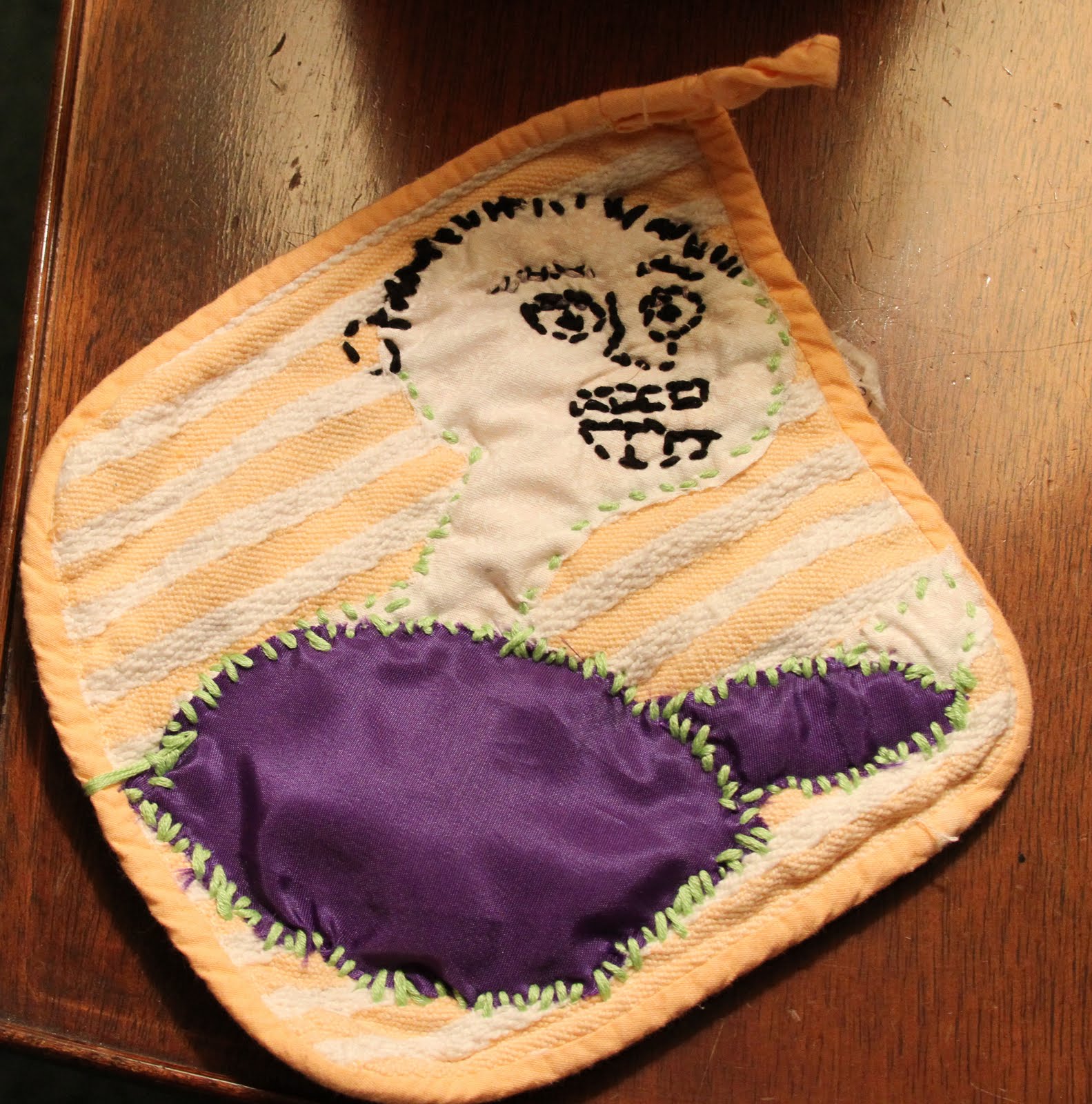
My creation.  This guy is still a work in progress.  He is hungry. 
He is going to be eating a cupcake.  This cupcake is Pam's creation

13th: Intro to wet and needle felting with The Shiny Brights.
An Australian rock band?  No. The Cincinnati Shiny Brights are an eclectic group with similar interests that periodically gather to socialize while they create crafts.  If you thought, “felt” was a synthetic square you cut up and glued in elementary school, prepare to be shocked because wool felting is an age old craft that far precedes polyester.  Wool felt is a non-woven fabric formed when sheep’s wool or animal fur is subjected to heat, moisture and pressure or agitation.  The shiny bright crew introduced two methods of felting, needle felting that is created by stabbing different colored pieces of felt into another, and wet felting, the process of dipping loose wool into soap water and rolling it into beads to use in many other crafts.  New to many of the attendees this was one shiny adventure with beautiful ends.

My felt ball and bead bracelet.  Also still a work in progress.

June 20th: Kalamkari fabric painting with Radha Chandrashekaran www.radartist.com
In the spirit of full disclosure I regrettably had food poisoning and missed this event.  But I learned from my new friends that this is an ancient technique of painting using a hand made brush made by wrapping fabric around a wooden skewer.  By holding the brush tip with the fingers and applying different amounts of pressure varying line thicknesses can be achieved.  It was apparently messy but very fun.  Totally disappointed I cannot give you more details.
June 27th: Book making with Annie Stephens www.anniestephens.com
Sewing together pages of paper, and two cardboard covers may sound simple but producing a decorative notebook that looks good and stays together is challenging.  The knotting method was calmly introduced by the energetic and multi talented Annie, and she patiently ran from table to table to assist with different skill levels of crafters throughout the evening.  While it was a challenging start there was also a great sense of accomplishment when leaving with a completed gift-able notebook. 

My first hand bound journal.  Still intact.  You may be receiving one of these as a future gift if I can get better at it.

July 11th: Sumi-e ink painting & yoga poses with Anne Ducharme 
This week was a little different from previous evenings with a focus on meditation through art and yoga.  The evening began with Anne guiding the group in meditation.  She taught a few yoga balancing methods and poses as a great way to clear the mind for inspiration.  Sumi-e ink painting focuses on the tools and on the process rather than the finished product.  There are many brush and ink washing techniques that can produce different images.  Letting go of a predetermined image provided surprising and interesting results.  The variety of crafter images varied from very dainty to broad strokes, very literal images and more abstract pictures.  It was as if each state of mind depicted differently on paper.  Anne was a calm encouraging influence and I left with a great start to my Sumi-e painting beginnings.

A sampling of my creative process.  The fish on the bottom left are Anne's work.

My three favorite works.  My meditative state is less calm, more movement.


Admittedly each week I do not leave feeling a master of each craft but I always leave excited by a new method of artistic expression to explore.  With a variety of materials to inspire creative minds, a relaxed atmosphere, and a friendly and enthusiastic crowd of attendees I continue to be impressed by the art created in this two hour period each Monday night at the Contemporary Art Center.

Upcoming opportunities to craft at the CAC:
July 18: Seed bombs with VisuaLingual
July 25: Woodworking and image transfer with Joel Armor and Joe Civitello
August 1: Mud cloth with Judy Dominic
August 8: Personalized Magnets with Cincy Craft Cartel
August 15: Henna tattoos with Sneha Nirody
August 22: Paper-craft with Jessica Wolf
Each week One Night, One Craft goes from 6 to 8pm and participation in some crafts may require paying a $5 materials fee.  Admission to the CAC on Monday evenings is free courtesy of Macy's.  Look forward to seeing you at the Contemporary Art Center!


On exhibit at the Contemporary Arts Center:
Currently the CAC is full with three ongoing exhibits to check out.  All three are impressive.
Maidens of the Cosmic Body Running: Majr Gazr
I continue to return each Monday after crafting to experience “Maidens of the Cosmic Body Running: Majr Gazr.”  It is a collective exhibit of work by Denise Burge, Lisa Sinders, and Jenny Ustick.  It incorporates expertly crafted hand made textiles, electronic and colorful video imagery, and trance like tones and repetitive relaxing whispers.  It is designed to be a multi sensory, participative exhibit dedicated to relaxing the participant.    
The relaxing effects of the combination of these influences is incredible.  All the elements of the exhibit purpose to “explore notions of utopia tied to feminism, nature, and spirituality.” Further description indicates the integration of the elements and craft, “Reference the Maidens’ notion of a female community; while the use of color, symbolism and textiles evoke the myriad of utopian communities that have emerged throughout the last century.”  Honestly, I was a little leery of that description initially.  I also was not sure how I felt about the community slippers.  My first visit, however, I had on incredibly uncomfortable heels and so while I was somewhat uncertain I quickly donned the slippers and grabbed a “map” illustrating the ways to participate in each aspect of the exhibit.  This first visit it was close to the museum closing and I was alone as I listened, watched, and became wrapped in the experience.  My stress melting away with the tones, images, and tactile influence.
Each time I visit I notice an additional element of the exhibit I did not in the past.  I later found the slippers are to protect the textiles as much as they are to add to the sensory experience.  Wearing shoes and walking on the hand made items would surely cause wear that would detract from the experience.  I find myself looking forward to visiting each week and am a little concerned how I am going to find the same stress melting effect once this exhibit has concluded.  
Hurry to experience this exhibit soon as it is only running through July 17th!
Matthew Monahan
The sculptures by Matthew Monahan are amazing to see.  His use of repurposed materials and the way he wields them into precise human form is totally impressive.  It seems his works are alive, eyes sparkling, muscles flexed, expressions expressive.  
The CAC website description so artfully describes this best, “Monahan’s sculptures seem to hover in a state of fleeting existence, projecting the illusion that the forces of nature could turn them back into unrecognizable rubble at any moment. His works succeed in engaging the viewer in a dialogue between contemporary and ancient; alien and disparate parts. His fragmented figures—with their active postures and facial expressions—convey the struggles of coming into existence in the present moment while carrying a sense of a past long gone.”  True.  Matthew Monahan’s work is worth a visit sometime before the exhibit conclusion on October 30th.  
Keith Haring: 1978-1982
This exhibit provides an exploration of Keith Haring’s work from his youth and early work through his height of popularity and some of his final works.  His efforts to make art accessible to all, and his broad quick intersecting lines helped to make him one of the “most iconic, influential and popular artists in the world.”  
This exhibit gives great insight into his artistic development, internal struggle, and immersion in the New York City Scene with rarely shown early work and some of his most notable images.  Personally I remember Keith Haring as I was first introduced to his work in first grade.  At the time his brightly colored, distinct human forms were being painted on city buildings and sidewalks in New York.  He must have been featured on Reading rainbow or something because I vividly remember sitting on the floor of Ms Ditkin’s (my first grade teacher) floor attempting to braid another girls hair and pay attention at the same time.  I remember liking the color usage the best. 
My early introduction to Keith Haring seems to have been quite flat with only an introduction to his work and a brief glazing mention of his death to AIDS.  What I did not remember being introduced to about Keith Haring in the calm afternoon of my elementary school art hour were his sexual influences, incorporated phallic symbols, and overwhelming drawings.  I was surprised to see some of his later work, sometimes violent red images of aliens and death.  It is funny how a purposely narrow sight, for a child or otherwise, can change the artistic impression of the patron.  Seeing this complete collection first hand with its large scale and detail is quite impactful.  This exhibit allows you to feel the challenges Keith felt in his shortened life, to understand his journey further, and it allows you to experience the impact of his broad brushstrokes and interconnected lines and elements.   

Monday, July 4, 2011

A Stylish Book Report: The Style Strategy by Nina Garcia

Finally a style how-to book I can fully embrace!  You may have picked up from previous posts I am somewhat of a clothing collector that loves to reinvent vintage, and embraces the cyclical nature of fashion.  You probably do not know I am lucky to act as steward to a small collection of hand-me-down duds from generations of my relatives from the 1800s to today.  Daunting, maybe, but a ton of fun!  With this in mind I always get annoyed when the first instruction in a style book is to purge anything you haven’t worn in a year.  Leave it to Nina Garcia to make me happy with her book The Style Strategy.

The Style Strategy is described as “A less-is-more approach to staying chic and shopping smart,” clearly it was written with the most recent economic downturn fresh in the mind, but it is more than a recession-ista guide to being stylish.  Nina gives great guidance on logical editing, reinvention, construction quality, and appropriate care of clothing and accessories.  She presents all of this sometimes less than sexy information with the same colorful illustrations, interesting historical fashion facts, and enthusiastic love of all that is stylish as her other fantastic guides.  The Style Strategy is a great intro for vintage shoppers, conservationists, fashion history enthusiasts, and artistic types alike.  
First in the book is a section on evaluating what you have and, yes, there may be purging involved.  Unlike other guides that direct blind purging, however, this evaluation section provides knowledge of garment quality, historical reference, and teaches an eye for how to find the treasures.  There are two types of clothing: disposable and collectible.  Many of today’s affordable clothing falls in the disposable category not because it isn’t stylish but because the construction is not finished to last longer than a few seasons.  After a few seasons unfinished edges begin to fray, colors significantly fade, hems pucker, or fabrics stretch out of shape.  Such is the case with some vintage as well.  Challenging are the fabric crazes of different eras.’  Some by necessity and scarcity of materials, others as technologies newest and greatest synthetics have fallen out of favor.  Sections one and two of this guide help you sort through them all to determine what really needs to go, and what can be reinvented and incorporated into new styling. 
When it comes to vintage, and some newer things also, a split seam, or imperfect fit is not necessarily a sign of low quality or a reason to give up hope.   Time could be the culprit in such wear and these errors may be cheated with appropriate care.  Section 3 of The Style Strategy describes the how, what, and where to get these workable imperfections addressed.  By highlighting tailoring, mending, caring for clothing and accessories it gives the option to extend the life of each item, and opens the wearer up to creating one of a kind and unique items.  It is also full of interesting info on how to tap stores off the beaten path for low cost, high quality items to incorporate into a wardrobe going forward.  Dance stores for tights, and flats; import boutiques for tunics and beaded items; and a plethora of other shopping resources.  Nina gives us her personal references on how to navigate so many shopping options for a find. 
In The Style Strategy Nina Garcia turns a frugal approach to fashion into an opportunity to feature individuality and ingenuity.  If you enjoyed reading the other style guides she penned you will also enjoy this book.  If you are looking for a light and fun introductory guide to discerning value beyond brand label you will also love this book.  The Style Strategy is a book to read for entertainment, knowledge, and is a good one to keep for reference.

Monday, June 13, 2011

Crushing on Dr Zahi Hawass


Maybe it was the gentle breeze on a beautiful night, or the suit with salt and pepper hair (ok more salt than pepper), or perhaps it was the shared love of adventure and excitement for the newly achieved democracy in Egypt.  Whatever it was, my crush for Dr Zahi Hawass continues with a vengeance.  I was left swooning and near speechless as he dramatically signed my new copy of the beautiful book depicting the Tombs of Thebes.  Sunday night at the Arnoff center the minister of state for Antiquities in Egypt spoke about his life’s passion, experiences, the current situation in Egypt, and the highly acclaimed Cleopatra exhibit now at the Cincinnati Museum Center.    
Dr Zahi Hawass (http://www.drhawass.com/) found archeology was his passion at a young age.  He spoke of his feeling of responsibility to discover, preserve and share the history of his country with the people of Egypt and the world.  While he was not the first to attempt this, he is the first to do it with showmanship, and an energy that made him the most recognizable person from his country.  He has embraced media from around the world to bring us history through an easily accessible source, written beautiful books to provide details to his accounts, and has inspired future generations of archeologists with his clothing line, hands on approach to discoveries, and dedication to children’s education.  For over forty years he has crawled through passage ways in the pyramids, excavated the deserts of Egypt, and through his pursuits surpassed Indiana Jones as the most interesting archeologist.  Pursuing his passion has taken Dr Zahi Hawass around the world and into the hearts of adventurers everywhere.   
His message was clear: Egypt with its rich history, current achievements, and focus on future possibilities is worth a visit.  Hearing of the newly achieved democracy several months ago I was moved to tears, and hearing of Dr. Hawass working with the military and people of Egypt to protect and continue preservation of the countries antiquities was truly inspiring.  Hearing him give the all clear to tourists, and realizing how supporting the traveling exhibits and traveling to the country itself helps to build this budding democracy was also motivating.  Knowing possibly more about the rich history of Egypt than anyone else Dr Hawass is proud of his country and has a strong vision for a democratic Egypt providing an impressive future.  He mentioned that many people tell him they come to Egypt because of him.  Hearing his passion and assurances of safety despite transition I also want to visit the valley of the kings and the harbor of Alexandria and to see the developments in a country of revolution.

I also cannot wait to see the Cleopatra exhibit right here in Cincinnati!  The Cincinnati Museum Center is second to none in the exhibits, professionalism, and presentation of history.  This exhibit continues that tradition.  We are one of only five cities in the US that will have the opportunity to view these items in person.  You may remember viewing their discovery depicted on the “Chasing Mummies” tv show.  After months of preparation this exhibit is now providing new insight into a mysterious and powerful figure in Egypt’s history.  I find myself looking for some glimpse of the face of Cleopatra.  Who was the queen that seduced the leaders of empires and ruthlessly fought to rule one herself?  While her image is still unknown this exhibit helps to give flesh to a woman so known for hers.  Available for viewing until early September Cleopatra is a must!  (http://www.cincymuseum.org/cleopatra/)

Monday, May 23, 2011

Orange Pumps


Osha orange pumps
I made these shoes.  The process was silver and orange waves of highs and lows.  The shoes started out a beautiful mirrored finish.  Tahari pumps, they were both comfortable, solid, and versatile.  I was dismayed when the mirror finish, after a good year of considerable wearing, rubbed off in a pattern tracing my toes.  I looked at this as an opportunity for recreation.
Experimenting with silver and gold leaf in recent projects I was convinced I could recreate the silver shine with leaf paint.  This was a disaster.  The silver leaf was more of a silver swirl than a shiny seamless finish and the sealing lacquer I applied as a top coat turned a puke like yellow.  Just gross.  
Impressed with the overwhelming pops of color swirling through my favorite fashion periodicals I thought of one thing, OSHA orange.  You know what I am talking about, the orange that is used to mark danger and construction guidelines.  What could be more eye catching?  I took the shoes in their silver yellow puke state to Home Depot where I consulted with a portly bearded man that barely looked at the shoes as I described my predicament.  His only word of advise was to sand the finish.  I thought this a little too simple and nontechnical but I trusted his guidance.  
after coat #1 note the dark spot on the left

Approaching the new orange shoe idea with gusto I purchased a hand held sander and removed all of the silver leaf paint (in a cloud of possibly toxic dust) and ruffed up the remaining mirrored finish.  I then took to applying several thin coats of the Osha orange paint.  Let me provide you with a caution: even if you paint on a box or disposable material, spray paint produces a cloud of small paint particles that can drift and paint other, not so closely, surrounding surfaces.  Luckily there was a rain before I started this project so my porch and patio furniture was wet and the orange mist easily washed off.  The first four coats looked good so i left them to dry.  Upon drying the results were less than exciting.  Splotchy, uneven, and generally unwearable.  They were not ready for my intended first wearing.  
painting in the grass.  coat #2

In sunnier weather my favorite spray painting location, the grass, was accessible.  Before giving up I decided to try a few more coats.  I took to applying another four thin coats and allowed the shoes to dry in the sun.  This was the final step needed for a stunning, even coat.  

making friends with orange shoes

Wearing the shoes the first time my toes were a little orange but I felt good.  As intended my creations are eye catching and fantastic.  Unfortunately the paint cracked the first time out.  It kind of looked attractive with the silver showing through the hairline cracks.  I have spray painted vinyl chairs before with much success and no cracking...that may have been a different type of paint.  With the second wearing many of the cracks gave way to chipping.  Still I don’t hate it.  They still grab attention, the silver peaking through almost makes me feel as though Tahari is erupting silver from beneath.  Last wearing I hid some of those cracks under jeans.  Worst case scenario, should this continue to progress to a less attractive state, I still have a sander and half a can of spray paint available for round three!  

wearing the shoes with a "dress" that is actually my aunts Liz Claiborne skirt circa 1980s belted with calvin klein and accessorized with FoundryM 

Friday, May 20, 2011

Cincinnati Fashion Week 2011 Recap


Last week was the second annual Cincinnati Fashion Week!  If you didn’t know Cincinnati has a fashion week, now you know!  Get excited for next year’s events now because the 2010 lineup was a blast, 2011 was a combination of unexpected elements that improved upon itself by the minute, and I can only imagine what fantastic things 2012 will bring.  This was an exciting week and even more exciting is the continued focus on Cincinnati as a destination for talent and entertainment.

I must preface my recap with a disclaimer.  Unfortunately this year I did not make it to all the events.  I missed Monday, Thursday, Friday and Sunday (I know that is half the week).  Even more unfortunate I am told Monday and Thursday were total parties.  However, on the fortunate side I had the pleasure of meeting the fabulous young blogger team of “The Fagazine” fashion blog (www.thefagazine.com) early in the week so I never felt out of the loop.  

Heading out to Tuesday’s event I had the internal monologue, “do I bring my big camera? It doesn’t really go with my outfit and will I lose the moment trying to capture each piece of it on film? But will I be satisfied with my elf quick pics?”  I opted to leave the large camera at home and was regretting it when I met my new friends Zach Shumate editor-in-chief of The Fagazine, Ryan Seminara contributor and photographer of The Fagazine, and Drew Reidenbach freelance publicist at The House of Orange.  Not only are these guys incredibly fun but we also have similar taste in fashion.  When I “oohed” at a design or pattern that caught my eye I found Zach “aahing” and Ryan snapping amazing photos simultaneously at the same things!  Needless to say I did not bring the camera or give it a second thought the rest of the week.  To check out the detailed designer pics, play-by-play of the pre, post, and everyday’s fashion week events I highly recommend reviewing all of the posts from May 9 to 14 on www.thefagazine.com.

And now for my personal commentary:

Tuesday May 10, 2011 
Men's Fashion Refinery

What do beautiful men, dapper fashion, orange caution spray paint, beer fermentation, and personal brand management all have in common?  Unexpectedly these were all elements of Tuesday’s “Men’s Fashion Refinery.”  Held at the future location of the Christian Morelein brewery in Over-the-Rhine.  This event combined many elements I find interesting and warmed my industrial chic heart.

[For anyone unfamiliar, Over-the-Rhine is an area of Cincinnati with a rich history.  Settled by German immigrants in the early 1800s, in its prime it was referred to as the “Paris” of the US with high levels of beer production and consumption, entertainment, and success.  Few know this is where Annie Oakley first ran into Buffalo Bill and auditioned for his crew, and this was the first place to introduce Burlesque to the US.  Cincinnati (Over-the-Rhine most severely) was devastated by Prohibition.  Recent and ongoing revitalization of the area has been successful in breathing new life to these streets, successfully highlighting the beautiful architectural details and introducing a new generation to the rich history.  Which brings me back to Men’s Fashion Refinery.]

I dressed casual for Tuesday but I also dressed for single men.  Jeans, flowing tank belted because men like to see a figure.  I opted for funky fresh accessories with a large white FoundryM garden chain and white watch.  For punch of color I went all out with my DeGroot hand bag (yeah for DeGroot, a local accessories designer) and personalized Tahari pumps spray-painted orange.  The OSHA orange spray paint caught a lot of attention and coordinated with the décor’!

I parked on a sidewalk, walked past a local porch party, and entered a visually stimulating warehouse full of Range Rovers, BMW, and Jaguars’ on display and a sign that stated my entrance constitutes release of my image for the filming of a mysterious production.  I grabbed a new Christian Moerlein summer brew, scanned the crowd of ridiculously dapper looking men of all ages, and perused the tables of local male fashions.

Men’s’ fashion is an area of fashion to which I have only recently been introduced.  In my limited experience it seems the success is in the details.  It is exciting to see Cincinnati has a great representation of beautiful modern and youthful menswear. 

Artfully Disheveled designer Christopher Berre focuses on high quality and interesting patterns with his collection of ties and pocket squares.  As a constitutional amendment supporter and adventurous type I am particularly fond of “the six shooter” tie pattern.  Not to mention I now have a crush on the voice of the “the network” blog on www.artfullydisheveled.com Not sure who is posting but I am following.  Products are available for purchase locally at 45/46 XY Inspired on Erie Ave and Pomegranate & Lime on Wooster Pike in Cincinnati; on the Artfully Disheveled website; New York, and Chicago.  Check out www.artfullydisheveled.com for more information.


Corwyn Apparel designer Corwyn Thomas also focuses on high quality and interesting patterns with much success but what really grabbed my attention was the brand new bow tie that is not yet available for viewing on www.corwynapparel.com (get excited as you are now privy to a new trend) they called it something specific and for the life of me I cannot remember what they called it (!?!Blog fail?!?), “The block” perhaps?  Let me describe it: bow tie in solid colors from pastel purple to electric orange all with white trim tied fat and slightly undone.  Love it!  You will have to visit the showroom to see these in person which may sound like a chore but after talking to Michael Warner the regional sales manager about the private fittings and events they host I am not only sold on the “block?” bowties but also on the experience.  Join the mailing list or contact Corwyn apparel directly by visiting www.corwynapparel.com


Jonathan Mezibov was the third menswear designer featured at Tuesday’s event.  He also provided a stunningly handsome collection in Saturday’s Fashion Finale runway show.  Beautifully tailored slim cut shirts with modern proportions in interesting patterns are the focus.  I was especially partial to the spread collar button down with a bib front in deep purple.  It had a pleating detail similar to a tuxedo.  Interesting enough to be noticed in a crowd but casual enough to be comfortable out on a Saturday night.  The purple is not yet shown but look forward to shopping for it on www.jonathanmezivbov.com

Moving from the expose` of all things male to a large back seating area for an interesting presentation on personal branding.  Key take-away:  be mindful of fit, location where wearing something, personal ascetic and differentiators, and attention to the details.  Elbow blowouts no more gentleman.  It may just blow your dapper man brand.

At any moment a model like photographer may be in a subbasement in Cincinnati looking stylish.

After the presentation the brewery tour was an interesting end to my evening.  As this is the “future” location of Christian Moerlein, the brewery that was toured was the 1880 brewery that originally inhabited the location.  This was great.  Similar to the “underground tour” described in one of my earlier blog posts, we started in the clean and refurbished warehouse main setting, traveled down narrow stairs, a hole in the floor accented with the previously mentioned orange spray paint, and into dank, mud dug tunnels to the malting subbasements that produced the millions of gallons of pre-prohibition brew.  I loved the relaxed tour guide, beer in hand and full of knowledge, and was especially amused by women in four inch heels climbing and trekking where heels have never been before.    


Tuesday was an evening of adventure.

Wednesday May 11, 2011
Tea with Mary

You know I love a day at the museum.  So it is no surprise I loved Wednesday’s Tea with Mary Baskett.  I arrived at the Cincinnati Art Museum too late for tea but in time for Mary and Cynthia Amneus, the associate curator of clothing and textiles at the Cincinnati Art Museum, to provide a video tour of Mary’s extensive collection of Yojhi Yamamoto, Rei Kawakubo (Comme de Garcons) and Issey Miyake.  Collecting since the 1970s Mary is dedicated to these designers.  Hearing her descriptions you can feel her appreciation and fearless dedication to wearing their creations.  And I love that she totally makes it all work. 

I loved hearing Mary’s stories of how and where she acquired key pieces.  Seeing the passion Mary clearly has for the unconventional forms, especially for the designs of Rei Kowakubo, was really inspiring.  I want to start a collection of something specific and stay dedicated to being stylish and rocking it for decades!  I was really struck by the soft spoken description of Japanese fashion appreciation of “the beauty in being undone.” 

After hearing this phrase I couldn’t help but get a little ticked at myself for not being so fearless and not celebrating the beauty in being undone.   I had intended to make a fantastic orange skirt out of fabric repurposed from the table decorations at my friend’s baby shower.  It was a great punching color but with limited construction skills and no pattern I abandoned it as part of my outfit because it ended up a little lopsided, kind of incomplete looking, and a little unflattering with little fit.  As I looked at Mary in her beautiful green skirt with a thick roll at the waist looking totally chic all I could think about was how I needed to be more fearless.  Her is what I wore and here is me celebrating my homemade creation since I didn’t on Wednesday.


What a beautiful place for a reception on the stairs of the art museum.  Great place for stiff drinks, delicious appetizers, a dj, and mingling.  I was excited to have an opportunity to express my love of the clothing and textile exhibits directly to Ms Amneus and I am now considering becoming a friend of the art museum.  Did you know if you are a friend of the art museum you are able to actually make an appointment for personal art consultations with a curator?!?  I don’t have any art to consult about but just knowing that is an option totally makes me want to join!
What a beautiful place for a fashion show as well.  Models, hair by Mitchells, dressed by Fetish boutique, and makeup like little porcelain dolls with pursed lips, paraded down one side of the stair case, into the crowd, and then up the other.  Fantastic showing!  (Check out http://www.thefagazine.com/2011/05/cincinnati-fashion-week-day-3.html for great shots of the show).  With so many interesting and wearable options on display it was hard to pick a favorite but the hot pink zippered shoe-booties paired with a structured grey dress may have pulled into the lead for me.  Well that or the all black leggings, black top, and red pumps accented with a black fedora painted with a woman’s face that Mary Baskett’s friend, equally as chic as Mary, was wearing.  Wednesday was possibly the coolest tea in history.

Saturday May 14, 2011
Fashion Finale

Enter through the side door, pass the docked boats, take the open walled elevator with the suited elevator operator, and emerge into the stark white walls and artfully columned industrial chic space that is “The Edge!”  All white chairs and a white runway snaking through the space ensure a perfect backdrop for the designer creations.  Seating section wrist bands color coordinated with vitamin waters placed on chairs were a subtle way of directing attendees to the appropriate section and the runway route was a brilliant way of ensuring that everyone was sitting first or second row. 

Outfit watching while waiting for the show to start was also incredibly entertaining.  Everyone did it up demonstrating personal style to the max.  Of course, I made my outfit, whip stitching an uneven hem 20minutes before leaving, and emboldened by the mantra “beauty in being undone” I wore it safety pin backing up my hook-and-eye closure and all.   The idea was to let the beauty of the intense purple fabric envelop me.  Creating a new shape with the fabric but still focusing on the fit needed for a curvy figure by letting it show through.  Lets be honest, I really didn’t need much more than that fabric to look fabulous.  I think the effect came across, imperfections and all.  Wasn’t the most polished look but I got some compliments and, most importantly, I loved it. 


The show:
Lindsey Lusignolo artfully combines tulle, Swarovski crystals, feathers, architectural details and great attention to fit to create drama and just a generally spectacular collection.  Focusing on custom bridal and evening wear pieces she offers the option of a couture experience through direct contact and collaboration http://www.lindseylusignolo.com/ and, coming soon, a showroom on Main street in Cincinnati. Had I seen some of the designs demonstrated in the runway show ahead of time I probably would have contacted Lindsey Lusignolo for a dress to the event in lieu of my creation, (although as a local favorite I wouldn’t have been the only one attending wearing a Lindsey.  Probably still would have been ok with that…). 

Personal favorites from Lindsay’s collection included the cream floor length satin gown with plunging back and silver Swarovski crystal and tulle leaf detailing; black sweet heart neckline with sculpted bodice and feathered explosion cocktail length number; and the maroon with electric violet sheen taffeta and violet tulle accent cocktail length dress.  Oh and the finale bridal number cream with a grey tulle explosion with grey origami like bustle, I can’t even put to words you are going to need to see for yourself (http://www.thefagazine.com/2011/05/cincinnati-fashion-week-finale-lindsay.html#more)…I could go on all day but the pictures say it all. 

I mentioned Jonathan Mezibov when talking about Tuesday  (see above) but while talking about the runway show let me reference more details by providing another link http://www.thefagazine.com/2011/05/cincinnati-fashion-week-finale.html

Laura Dawson is another designer with local ties.  I loved what she put down the runway and I love that she also has an online store http://www.lauradawson.com/ She is currently working out of London with distribution around the globe but for Cincinnati fashionistas this online access is key.  Her playful designs are full of interesting details and brilliant colors.  Personal favorite for me was the pink “scuba skirt” and fitted crochet sweater.  I loved the pattern of the sweater, they way she styled it with nothing underneath, and it looked super soft.  She also featured many beautifully fit and detailed fall trenches that for a split second made me excited for the first falling leaves before even reaching the summer months (that NEVER happens) http://www.thefagazine.com/2011/05/cincinnati-fashion-week-finale-laura.html for the full playful play-by-play.

If you love femininity with a bit of playfulness you are going to love Amy Kirchen http://www.amykirchen.com/ Her website does not give you the full extent of awesomeness that she showcased at the 2011 Cincinnati Fashion Week show.  She also has a boutique on Main Street in Milford Ohio and I am planning a trip as we speak to shop for spring.   I want the white large pocketed and belted romper and black jumpsuit.  The jumpsuits, the rompers, the patterns, the a-line skirts, and tailored office looks with blouson top blend references of the 1950s’, 60s’, and 70s’ but their modern tailoring and relaxed sex appeal say, “I’m not going to be your house wife or secretary unless it suits me.” http://www.thefagazine.com/2011/05/cincinnati-fashion-week-finale-amy.html

Amare Sinh is edgy and elegant. http://www.amaresinh.com/ blending cultural influences from around the globe the designs are a unique blend of colors and textures.  I love a texture fashion play.  On the website the gold blazer is something I could see heightened to classic status in my closet.  At the show, I was impressed with the designer’s use of full faux fur pelts in a way that still highlighted the lithe figures of the models.

Cala Ossidiana swimwear collection http://www.calaossidiana.com/ was understated with its focus on solid colors and classic lines but with mesh insets, knot backs, and seductive extra long ties these suits were anything but basic. http://www.thefagazine.com/2011/05/cincinnati-fashion-week-cala-ossidiana.html If you like prints you are out of luck but if you like multiple options for how to move the bikini strings to avoid tan lines, and not seeing other people wearing the same suit, you are going to want to check the Cala Ossidiana options.

Amanda Valentine http://www.amandavalentine.com/ hand makes each piece.  Where Amare Sinh was a texture play I would describe Amanda Valentine as a pattern play as she artfully combines interesting patterns in unexpected ways.  I found her sliced dresses to be visually interesting and I really loved the statement jewelry pieces that adorned many of the looks.  She has a link from her website to her etsy store which I am hoping to find freshly stocked in short order.

Arbitrage made its second Cincinnati Fashion week appearance. http://www.arbitrage.com/ You may find the Arbitrage man familiar from Cincinnati Fashion week 2010 or you may find it familiar from some of the many Hollywood hunks that dawn the duds on the red carpet.  The interesting details are really what make this line.  Last year seemingly basic shirts were lined in poker themed patterns and this year, while patterns still played a role in the collection they were toned down and subtle by comparison.  My favorite part about the Arbitrage 2011 runway showing was the interesting and cool hooded shirt.  I could see it paired with a 22inch funky fresh garden chain from Foundry M on a casual weekend!   Favorite item on the Arbitrage website: “movember” Manchu mustache shaped cufflinks!

Melissa Tabor http://melissatabor.com/ does dresses well.  Exposed zippers, check; understated colors and interesting textures, check; fit and structural details, check and check.  I found each of her pieces to be incredibly wearable.  While she represented options for every occasion (love the formal cream low back number) I found the structured top day dresses and interesting suiting to be the strong point of the collection.  They could easily be styled to go from day to evening and provide comfort for a woman on the go in places often overlooked.  Pockets for a day dress are borderline essentials anymore in a skirt full enough to handle them and her zipper ties allowing for self closure (or easy opening) were unexpected, looked chic, and are totally convenient.

Avni Trivedi is all about fabric. http://www.avnitrivedi.com/ Focusing on sustainable fabrics, sourced from traditional artisanal production means across the globe blended old world culture with new areas of global importance.  Many of the silhouette proportions were unusual but allowed for the fabric to remain the focus of the design.  Personal favorites were the white shirt with floral embroidered hem, the use of scarfing, and the finale dress that was a beautiful combination of fabrics and demonstration of draping.  Also, while I do not think I could ever wear a horizontal striped pant I still remain strangely enamored with them… check out the full details at http://www.thefagazine.com/2011/05/cincinnati-fashion-week-finale-avni.html   


The After Party

After three fantastic hours of fashion awesomeness it was on to the after party at the Weston Art Gallery.  Have you been to the Weston Art Gallery?  Admittedly this was my overdue first trip.   My intention was to tour the exhibit before diving completely into the “Exhibitionism” themed party but we decided to get a cocktail first… A return visit to the gallery is in short order as there was no turning back after making the trip to get drinks.  The cocktails were located through the gallery, past the participation art (the half naked man you could paint at your whim), past the wall of large round mirrors, past the woman in the bathtub full of feathers, past the floor to ceiling delicate white fringe, past the dance floor, the deejay, the face painting artist, spoofs of recognizable art in the buff, and past countless patrons in all levels dismissing their inhibitions.  Everywhere you looked there was something interesting to look, touch, or taste.  The x mango flavored vodka with soda and a splash of OJ was reminiscent of the vitamin water I had earlier and just as refreshing.  After a few of these, a little dancing, and a bit of saucy “Framester” photo booth pictures with new friends, and the night was over before I made it back to check out the art.  This party was refreshing art in itself. 


…Ok the evening may have ended a little later after chips, guacamole, and after several more hours of dancing but that is going to be for another blog.  I am fabulously exhausted!


Tuesday, April 12, 2011

I dreamed of this dress and it showed up at Target!

I love color blocking.  
col·or block·ing: v.  the practice of putting two or more blocks of solid colors next to each other.  
Wow, earth shattering definition.  Sounds easy enough.  
This is not a new trend.  Think 1960s mod A-line with contrasting colors sewn together...heck, Wonder Woman color blocked.  Currently the trend involves blocks of colors with just a different enough hue to be OMG new.  I would best describe the key to success in color blocking today like this:
First imagine the old Crayola “Bold” colored marker set.  You could imagine you accidentally left the lids off the Bold markers for an afternoon or so and then tried to draw with them.  You would still get the new bold hue but it would be somewhat muted.  Next imagine the Crayola “Florescent” marker collection (do they even call them Florescent anymore?).  Leave the lids on until you are ready to use them.  Draw blocks next to each other of one bold and a contrasting florescent and, sha-zam!,  color blocking of today!  
                                                       -Me, 2011
I am to color blocking of today as my fellow preteen girls were to NKOTB circa 1990...totally infatuated and feeling like I just didn’t yet have what was needed to make it mine.  I say this because I have very few florescent colors in my wardrobe collection at this time.  I knew i could make the trend work but, as I am trying to stay away from shopping, it just wasn’t coming together. 
Then I had a dream!  I dreamed of this dress and it showed up at Target!  


Intro Thakoon color block dress for target international capsule collection.  

There are positives and negatives about this Target fashion buy.  
Positives:                              Negatives:
-Economically priced                              -There may be thousands of girls wearing the 
-Easy to clean                                same dress.
-Capsule collection maybe not              -Less luxurious and/or synthetic fabrics 
that many girls know about it                      -Having to walk past that dollar bin that always
        -Access to coveted designers                       coerces me into purchasing things I really don’t need
In my mind the positives out weighed the negatives.  
I paired my new color blocked option with a faux pony hair belt, nude nine west pumps and, while it is difficult to see in the picture, nude fishnet stockings.  I am loving this!